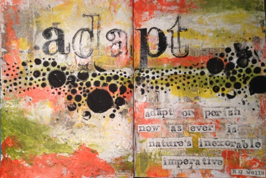
Adapt. It’s a word that’s gotten a lot of use around here this last week, even if only in my head.
Don’t have enough bathroom storage? Adapt.
The new routine involves waking up and driving in New York traffic every weekday morning to get the husband to the train station? Adapt.
Nearly every face you look into every day is a stranger? Adapt.

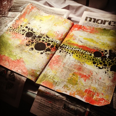
I shared this photo a few days ago on Instagram and Facebook. It was a page I had worked on for hours, adding layers and then either covering them up or tearing them off because I just couldn’t come up with something I liked. When I reached the point where the photo above was taken, I had finally fallen in love with the page but knew that it just wasn’t finished. I was scared to dive back in…I didn’t want to wreck it again, but I received a gentle nudge from a perfect stranger in an art sharing group: “Be Brave, Jaimie.”
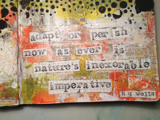
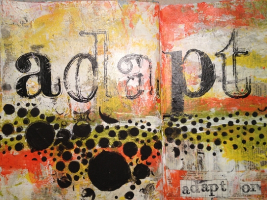
I did the title lettering with these oh so wonderful monogram rubons I found in the craft section at TJ Maxx probably two years ago. They’re called Swatchbook Impress-Ons by Art Warehouse and Danelle Johnson. I haven’t been able to find them since, although I’ve seen similar versions in full color for sale on Etsy. Other supplies used include old dictionary paper, fluid matte medium, gesso, and Golden Fluid Acrylics in Pyrrole Orange, Hansa Yellow Opaque, and Green Gold (paints and gesso were applied with my fingers or cardboard). The fabulous texture across the middle was created with the Prima 12×12 Bubbles stencil and Studio 490 Black Embossing Paste (applied with a palette knife).
I hope you’ve enjoyed the first of what I hope will be many Art Journal shares.
See you soon, and in the meantime I’ll work on my iPhone photography skills.


